If you could see me right now you would see that I’m shaking my head as I stare at multiple monitors displaying medical practice websites.
I’m perplexed.
I’m perplexed because I’m staring at how much opportunity for revenue is potentially being lost online by medical practices.
As a digital marketing firm focused on medical practices, we understand. The ever-evolving landscape of consumer behavior is always changing. Traditional marketing tactics like billboards, yellow pages, TV commercials, and radio ads are becoming far less effective. Why? Because there is an unending amount of information right at our fingertips in an instant.
As a Growth Strategist focused on medical, I spend a lot of time analyzing medical practice websites.
I critique websites based on 4 separate categories:
- Design – I critique the overall layout and functionality of a website. Is it up to date? Does it utilize space well? Is the messaging clear? Does it lead potential patients closer towards making a decision?
- Traffic – I pull a sampling of each website’s traffic and I look for a few things: Does the practice’s website have consistent growth in visitors? Does the website have any spikes or abnormal behavior patterns? Is the volume really high or really low?
- Content – I critique the production and quality of a practice’s website content. Is there a blog? Are the blog posts updated frequently? Does the site have updated and optimized pages? Do they offer eBooks?
- Search Engine Optimization (SEO) – This is all about strategically structuring your content and site architecture to ensure optimal performance in search results. It’s not about gaming Google, but rather knowing where and how most of your potential patients are searching and getting in front of them. Are your blog posts and copy keywords optimized? How fast is your page speed? Are you ranking for keywords that your competitors are ranking for?
I’ve reviewed over 200 medical practice websites this month, and these are the 6 costly mistakes that medical practices are commonly making…
1. Poor use of “prime” website real estate
The term “above the fold” is commonly used in marketing and website design. Above the fold is referring to the part of your website that is showing when someone first lands on your website without scrolling. This part of your website is going to get the most attention because it is the first thing someone will see when interacting with your brand. So why would you clutter it, confuse the visitor, and not give a clear call-to-action to inspire your potential patient to engage with the “next step?”
In a concise, yet clear way, your website’s above the fold section should tell a story that talks about what you do, who you do it for, how you do it, and how your patients can get hold of you or set up an appointment (aka a clear call-to-action button). When I say concise, I genuinely mean very concise. Short and to the point. There is certainly a place on your website for your practice history, your mission statement and awards you’ve won—but just not above the fold.
Visitors want to know up-front that you a solution to their problem, pain, or ailment that is going to make their lives easier, and they want to know how they can access that solution easily.
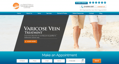
Here is a good example of a website, Beach Cities Vein & Laser Center, that is utilizing the space above the fold well.

What are they doing well?
It starts with an appealing picture of varicose free legs walking on a beach, presumably a happy couple enjoying life that you can have after treatment. They tell you exactly what they do and what the end result is going to be “Varicose Vein Treatment (what they do) – Learn more about how we can help you say goodbye to bothersome varicose veins (end result).”
They also make it incredibly easy and obvious on how to get ahold of them or set an appointment. In the top right they list their phone number with a contact us button, and just above the fold they have an online appointment setting function. People gravitate to that which makes their lives easier and saves them time.
2. Most Practices Fail SEO
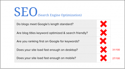
Out of the 4 categories that I mentioned at the beginning of this blog (website, traffic, content, and SEO), many practices are failing to execute on SEO, hands down.
When I break down the numbers on the websites that I audit, easily over 90% of practices fail the majority of the SEO subcategories.

This is unfortunate because SEO is far more important than people realize.
In Pew Research’s most recent study, analysts found that 72% of adult internet users turned to search engines to search for medical related information and direction. This number has continued to increase since 2014.
I bring this study up to show consumer behavior. The internet is changing the way everyone makes decisions and finds solutions. If you aren’t showing up high in their search results then you are missing out on a prospective patient.
Solution: Create more relevant content around the questions that potential patients are having. Make sure that your website copy is keyword optimized and tailored to your ideal audience.
3. Pages Load Too Slowly
Yes, this is a real thing, and yes, this matters.
Page speed plays a huge role in today’s “immediate gratification” society. If your page loads too slowly you are potentially losing patients. Not only does this impact your Google ranking, but it is also just incredibly annoying.
When a potential patient is searching for help or a solution to a problem, they are impatient when it comes to how fast they can obtain information. If your site is taking too long to load they will hit the back button and click on the next search result down, which will give them what they want—when they want it.

Solution: Optimize your images and videos, minimize your javascript and css code, and enable compression. If you have no idea what these things are, then ask someone who does. It’s really important!
4. Not Having a Responsive Site (or Having a Bad Mobile Experience)
Along with page load speed, having a great mobile experience is essential. In fact, mobile user experience is one of the top ranking factors in 2019. Think about how your site looks and performs on your phone—did anything seem frustrating? Could you perform everything your patients want to do on your site?
These days most people are using their phone more than they are a computer and it is essential that your site works well on the phone, because if it doesn’t you’re going to lose potential patients before you even have a chance to interact with them.
Solution: Make sure your site is responsive and optimized for use on a mobile device. If you’re not sure what that means or how to solve problems with your site’s responsiveness, then ask an expert. It’s really important!
5. Zero, Few, or Poor Calls-To-Action
A call-to-action is exactly what it sounds like. It is something that tells your website visitor to take action in some way, shape, or form. The objective of a CTA is to capture leads (i.e. name and email). Some examples of a CTA are “Set appointment today,” “Call today,” “Download your free eBook today,” and the list goes on.
Here’s an example.

On many websites, I frequently see a few mistakes…
First, they have CTA’s (or buttons that are meant to be CTA’s) but they are not actually calling the visitor to an action that helps generate a lead or potential patient. They use buttons that say things like “More info,” “Read more,” or “Our story.”
Second, they have CTA’s that could be lead generating, but they are poorly placed or irrelevantly placed. They are too small, not obvious, or are placed in the bottom of a page somewhere that isn’t easily visible.
Finally, people just flat out aren’t using them enough, or at all. Sometimes practices aren’t using them out of fear that they will annoy a site visitor and deter them, but the opposite is actually true. It is far more annoying to go to a website and not be blatantly told where to go, what to do, how to do it, etc.
Think of CTA buttons as directional signage, they help your website visitors navigate your website to get the outcome they are interested in.
Solution: Look into your site’s analytics. Where are people coming from, what pages are they visiting on your website, and how long are they interacting with that page? When you understand what is converting (aka website visitors into practice visitors) you know where you need to make adjustments.
6. Practices are not effectively blogging… or not blogging at all
Most medical practices are not blogging with a purpose—or they’re not blogging at all.
There are many different types of content that can be produced to help inform patients and motivate them to choose your practice. While some work better than others, blogging has consistently outperformed traditional marketing and other content because it is a triple-threat. It is used to build brand authority, grow your organic traffic, and convert visitors into leads, or new patients.
A common issue is infrequency when it comes to posting blog content. Most practices are posting at a frequency of one or less blog posts per month.
A solid content marketing plan, that includes blogging, will post keyword specific blog posts that address real problems and questions that a potential patient may be searching for on the internet. The goal is to create relevant content that is going to help your patient, and that shows up where your patient is searching.
In terms of frequency, effective blogging should be done at a minimum of once per week. Feel like you can’t think of that much material? We created two months of SEO-optimized blog post titles to get you started!
If your medical practice is bursting at the seams with business, then none of this may matter to you. But my hunch is that this is not the case for the majority of you who clicked on this article.
As a digital marketing firm focused on medical practices, we understand. The ever-evolving landscape of consumer behavior is always changing. Traditional marketing tactics like billboards, yellow pages, tv commercials, and radio ads are becoming far less effective. Why? Because there is an unending amount of information right at our fingertips in an instant.
The consumerization of health is upon us. Don’t throw your hands up. Just adapt!


