Your website is often times the first interaction that a potential customer or patient has with your brand.
As such, your website serves as a first impression for new patients. Like any first impression, it can inspire them to stick around and look at what you have to offer more closely, or it can make them hit the back button and move on to another medical practice.
It’s as simple as that—your website can inspire new patients to consider your practice, or make them move on to another option.
So what is it about a medical website that inspires patients to consider choosing that practice?
Here is a list of 10 medical websites that are sure to inspire you…
Northwestern Medicine (Chicago, IL)
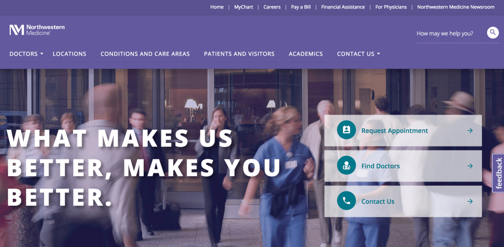 Northwestern Medicine does a great job utilizing color contrast and calls-to-action. Patients visiting their website know exactly how to request an appointment, find a doctor, and contact them. They also utilize their headline well, “What makes us better, makes you better.” Patients want their provider to be confident in their work because the patients want to be confident in the outcome.
RBK Pediatrics (Bay Shore, NY)
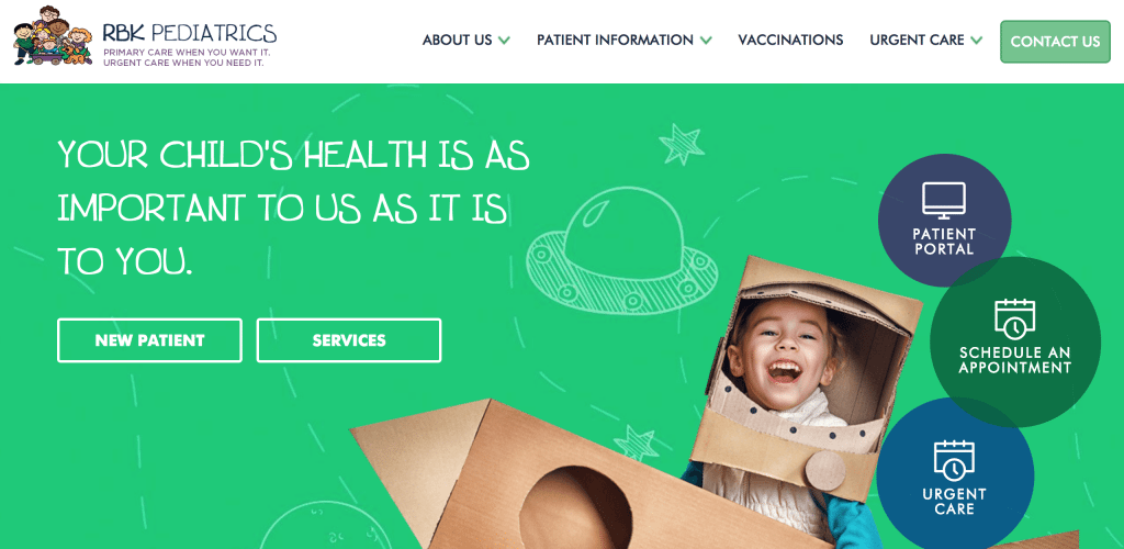 RBK Pediatrics tells a phenomenal story without saying many words at all. When your child’s health needs attention, they should be seen by someone that is going to care for them like you care for them. The website is inviting, speaks to the demographic, and makes you feel like they understand their audience.
Carolina Vein Specialists (Greensboro, NC)
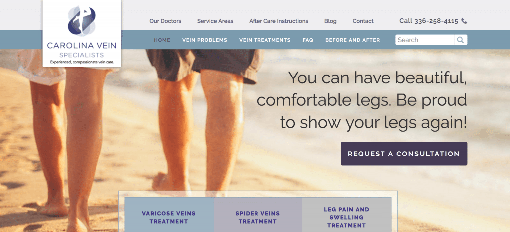 Carolina Vein Specialists has a great headline that gives their website visitors hope that if they go see Carolina Vein then they, too, can “be proud to show (their) legs again!” They highlight what people really want. People don’t want to go see a doctor and have surgery, but they do want the end result—pleasure, comfort, aesthetics, etc.
Mid-City OBGYN (Omaha, NE)
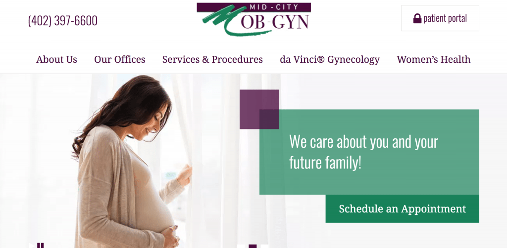 Mid-City OBGYN makes simple work really well. They utilize one, clean image of a smiling patient along with a clear and concise headline, “We care about you and your family!” followed by an obvious call-to-action “schedule an appointment.” This makes visitors feel welcomed and that they are going to be cared for.
Akler Eye (Dearborn, MI)
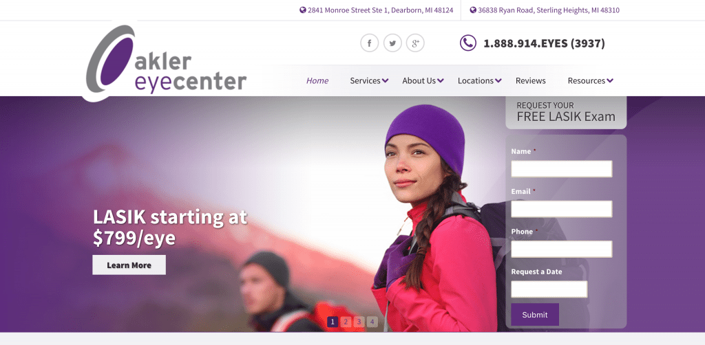 Akler Eye does a wonderful job of answering all of the basic questions someone visiting their website might be asking: What do they do? How much does it cost? How do you get ahold of them? They make it very easy for someone to sign-up right when they land on the homescreen, making it incredibly user-friendly.
Radiance Wellness Medispa (Southlake, TX)
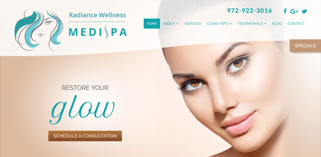 Radiance Wellness Medispa conveys the consumer’s desired outcome well, that their skin will glow again. Not only does Radiance tell consumer’s that their skin will glow again, but they also show it with an attractive, glowing image of a “patient.” This is then followed with a well placed call-to-action, “Schedule An Appointment.”
Advanced Vein & Vascular (Wayne, PA)
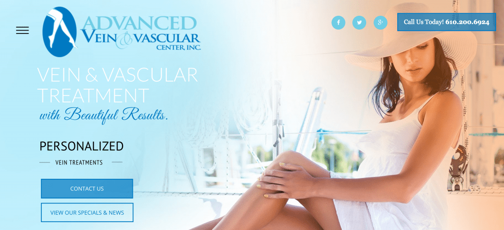 Advanced Vein & Vascular does a few things worth noting. They make it very clear about how to get ahold of them, they utilize attractive and clean images to grab your attention, and they do a good job of highlighting their social media. Social media can be used to generate brand awareness, referrals, and customer retention.
Peachtree Bariatrics (Atlanta, GA)
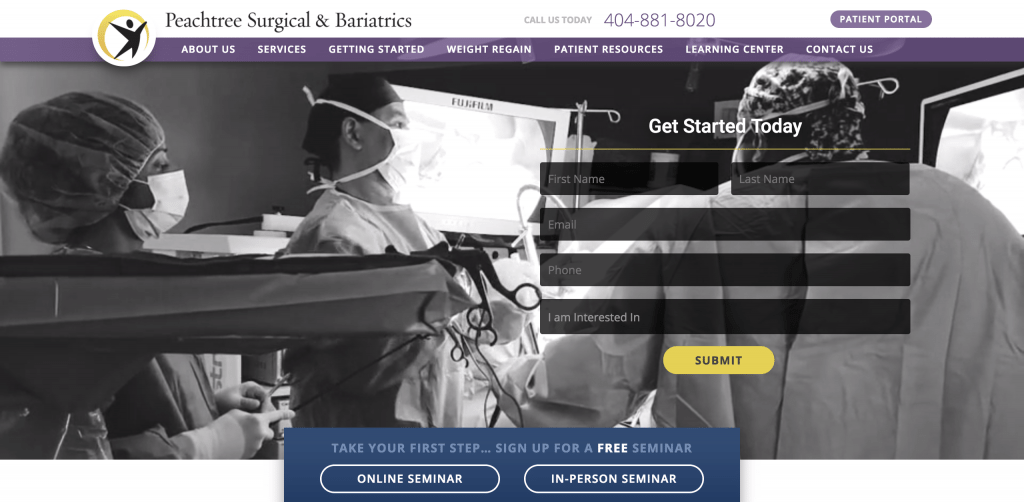 Peachtree Bariatrics utilizes an incredibly effective form of inbound marketing. They utilize webinars and lead capturing forms on their homepage. This gives a lot of free, valuable content to their potential patients, which helps educate patients as well as qualify them as leads.
Lad Neurosurgery (Durham, NC)
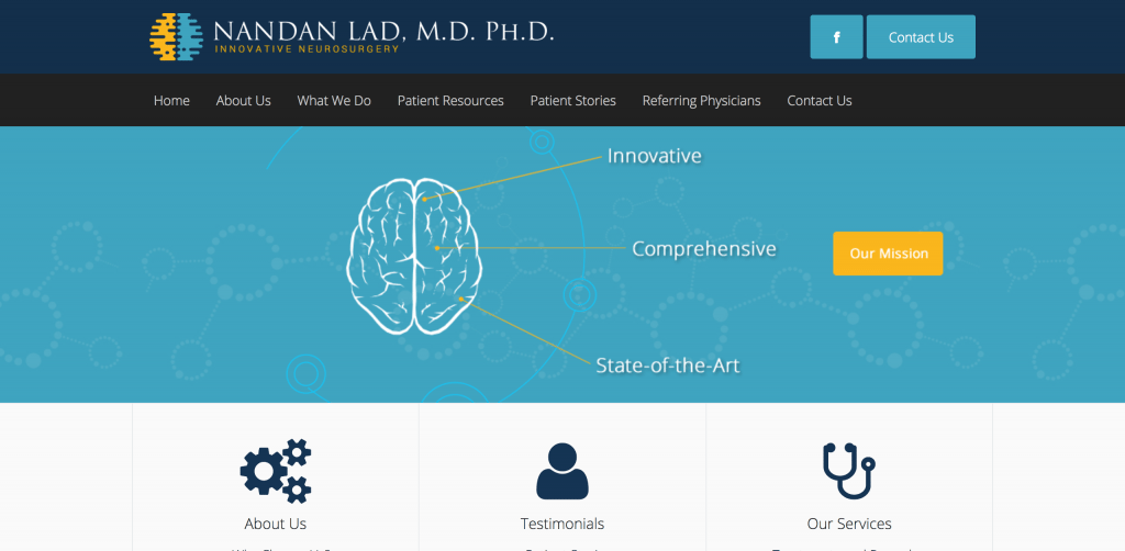 Lad Neurosurgery is simply just visually appealing. It is not over-the-top, but it does a great job of highlighting the main things that website visitors probably want to know: Who are you (about us)? What exactly do you do (our services)? What have you accomplished with your work (testimonials)? How do I get ahold of you (contact us)?
Atlanta Obstetrics and Gynecology (Atlanta, GA)
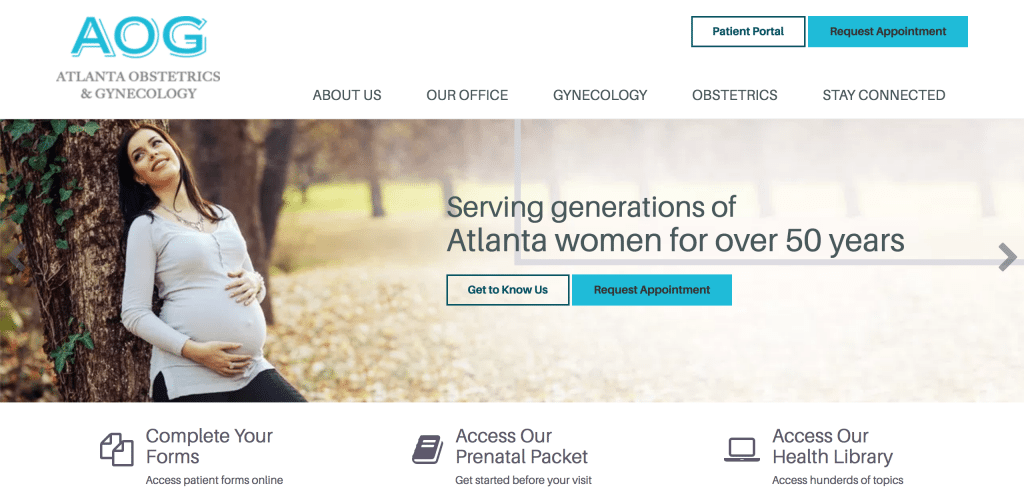 AOG uses their above the fold well. They make sure that you are welcomed with an inviting, happy picture of a woman who many website visitors can relate to. They also make it easy to navigate the website with large icons that lead them to important information or forms.
In conclusion….
After analyzing 200+ websites last month I found that no website is perfect, see my last post, but the list above is proof that sites can be done really well. They can be really clean, can generate leads for your practice, and can tell a great story. So why shouldn’t your site do the same?
Inspired? Want to know what a new website or a website redesign might cost you? Check out our website calculator.
[cta id=”1963″ vid=”0″]
