Ever wonder how to get noticed online in an oversaturated space? It’s a problem, for sure.
There is, however, something you can do on a reasonable budget to step up your game and get ahead of your competition.

While it’s tempting to think that you need to talk like an expert on your website to attract attention, this isn’t a recommended way to get noticed online by your ideal patient.
It just won’t work because this isn’t how your ideal patient is looking for help. When he searches online, he doesn’t want to read jargon he cannot understand.
Your ideal patient wants solutions to the questions he’s been carrying around. Talking at him won’t help. You need to talk to him.
Similarly, just spending lots of money—more than $30,000—on a website redesign to make it visually appealing won’t protect your wallet or increase traffic to your website.
This is especially true if you spend most of your budget on web design instead of ensuring your site is both functional and filled with great content.
Learn more about marketing budgets here .
Here’s What to Do Instead
Your site and all messaging born from it need to align around a clarifying message, as StoryBrand would say. This will help your ideal patient connect with you once he lands on your site or reads any of your messaging.
If you want to better connect with your ideal patient, get clear about what you do—and why. This message needs to be tailored and consistently talked about in the same way from all of your staff.
Let’s Get Technical
Within the StoryBrand framework, there is a hero and a guide.
Your brand (or your medical practice) is the guide, not the hero. Making the brand the hero is the biggest mistake most companies make when marketing.
Who is the hero? Your ideal patient.
Why so? Because he is the one moving from pain to improved health and wellness. You’re just there to advise.
Everything you do from now on should be tethered to this framework. No more acting like the hero. Let your ideal patient play the role of protagonist.
Here is an example of you (the guide) helping your ideal patient (the hero).
In a bariatric practice, your ideal patient arrives at a seminar and needs to lose weight but hasn’t found success. His motivation stems from wanting to go to his son’s college graduation in three years. If three years pass and nothing changes, he may not make it to his son’s big day.
You know how to help your new patient lose weight and quickly formulate a plan, telling him what to expect and what to do when the journey gets difficult. Eventually, the day comes when your patient finishes treatment and finds success. The hero has done it again—rallied on. The plan worked after all, even with you staying out of the limelight.
Talk about appealing. Your ideal patient fought hard and won. Everything worked as it should in this story. It’s a good ending.
And just think, you can create a similar scenario for your ideal patient when you clarify your message to focus on him.
Want to know more? Read more about how to make your customer the hero here .
Find Clarity, Then Act
Do this first: After clarifying your messaging internally by building a simple one-liner of what you do and why you do it, your next focus should be to update all messaging to reflect this shift. All messaging must elevate the truth behind your one-liner.
Do this second: Redesign your website. Here’s why: A web design born out of clarity continues to drive home the point that your ideal patient is the hero. The end goal is to get him to take a specific course of action.
An ideal patient who visits your site should know exactly how to find what he needs. Remember, you’re guiding him through this process. Make sure you have built a site with him in mind.
Do this third: Now it’s time to ensure your site is easy to navigate. Navigational words, signs and buttons on your site can—and should—alert your ideal patient where to go to find what he is searching for.
The questions posed below can help you figure out if your medical website is up for the task at hand:
- Do you talk about symptoms and solutions?
- Is there a “request an appointment” button?
- Is there a page with doctor bios?
- Are your service lines or specialities listed and described?
- Is there a blog with helpful content that answers common questions people ask about the conditions you treat/service lines you provide?
- Are there pictures of your practices so they can better visualize your locations?
- Are patient reviews listed on your site?
- Does your site contain Google maps for your multiple practice locations?
- Is contact information listed?
- Are icons linking to your social media sites clearly visible on your homepage?
A few seconds on your homepage should be enough time for any site visitor to understand what you do. Navigation then can step in and guide your ideal patient to answers he is seeking by making the important things about your practice accessible with the click of a button.
Want a kickstart on blog post titles? Try these SEO-optimized medical blog post titles here .
Key Takeaway
Marketing dollars only go so far. Don’t throw all of your money into creating the coolest website and the cleverest messaging.
Use your budget wisely and allocate dollars to making your website and your messaging clear, concise and consistent and you’ll see it impact your bottom line.
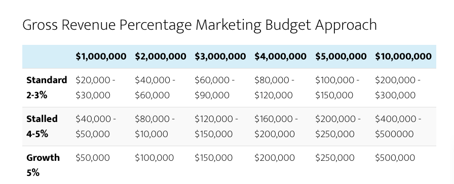
See below for a quick reference to allocating an appropriate gross revenue percentage to your marketing budget:


